Our visual identity
The visual elements of our brand can be a person's first touchpoint with MidChains. Using them consistently and to their fullest shows people who we are and helps to build recognition.
Overview
MidChains transforms complexity into clarity and our visual identity represents the frictionless nature that sits at the core of who we are.
Our logo
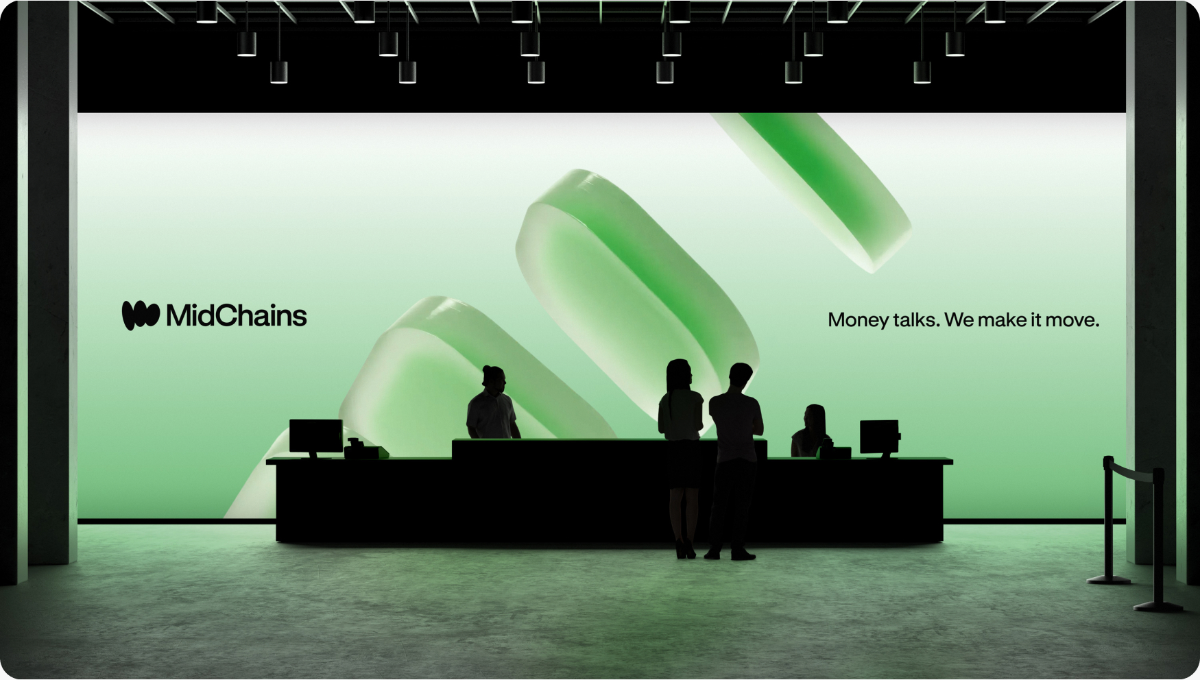
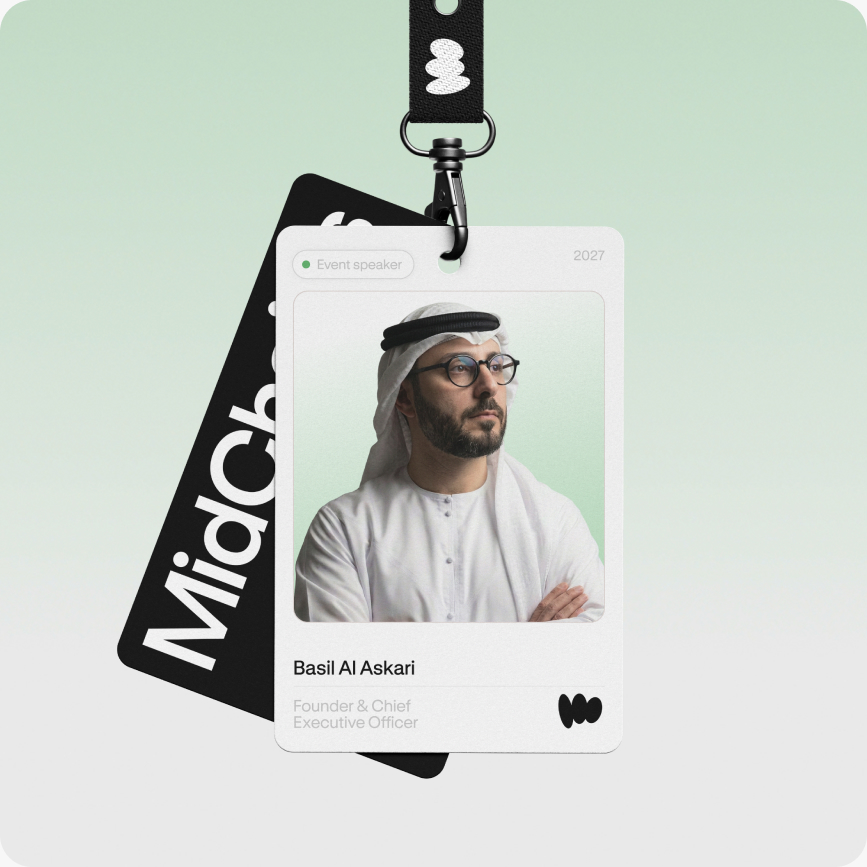
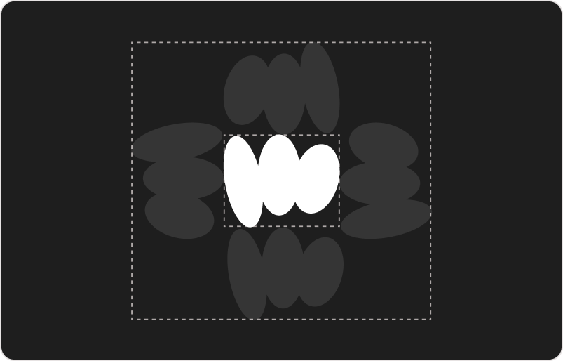
Our logo is our signature, an abstract ‘m’ made up of three coins, supported by a clean wordmark that is both clear and confident - in both long-form or short-form it signifies who we are.
Our full logo
When space allows, use our full logo proudly, in black or white.

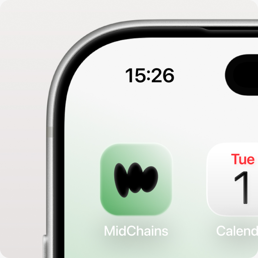
Our mark
When space is tight, or the format dictates, use our mark only. It's synonymous with who we are. As with the full logo, it can be used in black or white and it needs space all the way around.
Our wordmark
There are some special instances where our wordmark is used separately from the icon, examples include using the logo at large scale where the proportions work better as a block. In these instances the wordmark should be used in black or white.

Clear space
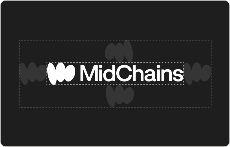
Our logo can be positioned or aligned in the way that looks best on the format, but it always needs space to breathe. Allow the height of our M in clear space all the way around.
Brand colours
With clarity at the core of who we are, we keep things simple with our brand colours. We own green, black, white and suite of greys - helping us stand out online and in print.
Primary palette
Secondary palette
Greys
Gradients
Typography
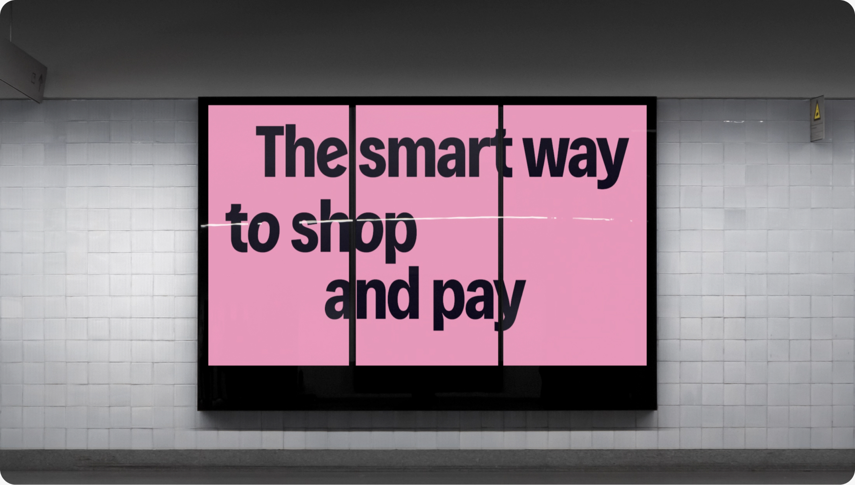
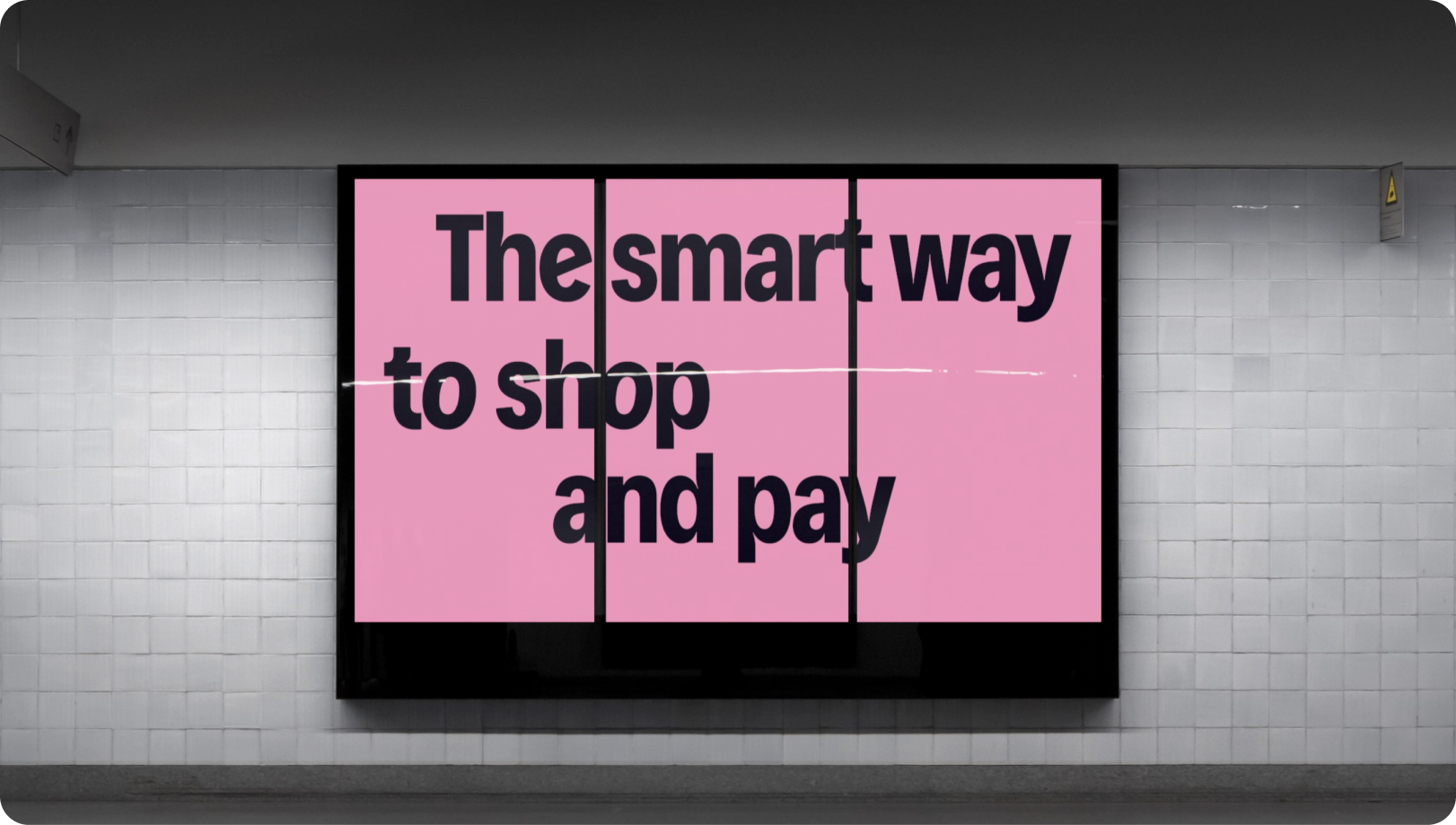
Our typography is frictionless. It offers clarity for complex information and boldness for hero messaging. Our typographic system is made up of one typeface which supports clear communication and offers freedom of use.
Our typefaces
We use just one typeface in three weights for our brand communications. GT Standard Medium is our headline typeface, while GT Standard Light and Regular are our body copy fonts.
Typographic hierarchy
Follow the guidance shown below to ensure that we flex our typeface to maintain clear hierarchy in our communications.
For headlines we use GT Standard L Medium
For highlight copy we use GT Standard L Regular. Lorem ipsum dolor sit amet, consectetur adipiscing elit, sed do eiusmod tempor incididunt ut labore et dolore magna.
For body copy we use GT Standard L Light. Lorem ipsum dolor sit amet, consectetur adipiscing elit, sed do eiusmod tempor incididunt ut labore et dolore magna aliqua. Ut enim ad minim veniam, quis nostrud exercitation.
Type settings
To keep all copy consistent with the MidChains' brand, follow the guidance below.
In use
Like us, our typography is confident and should be used proudly, without too much fuss.
Visual assets
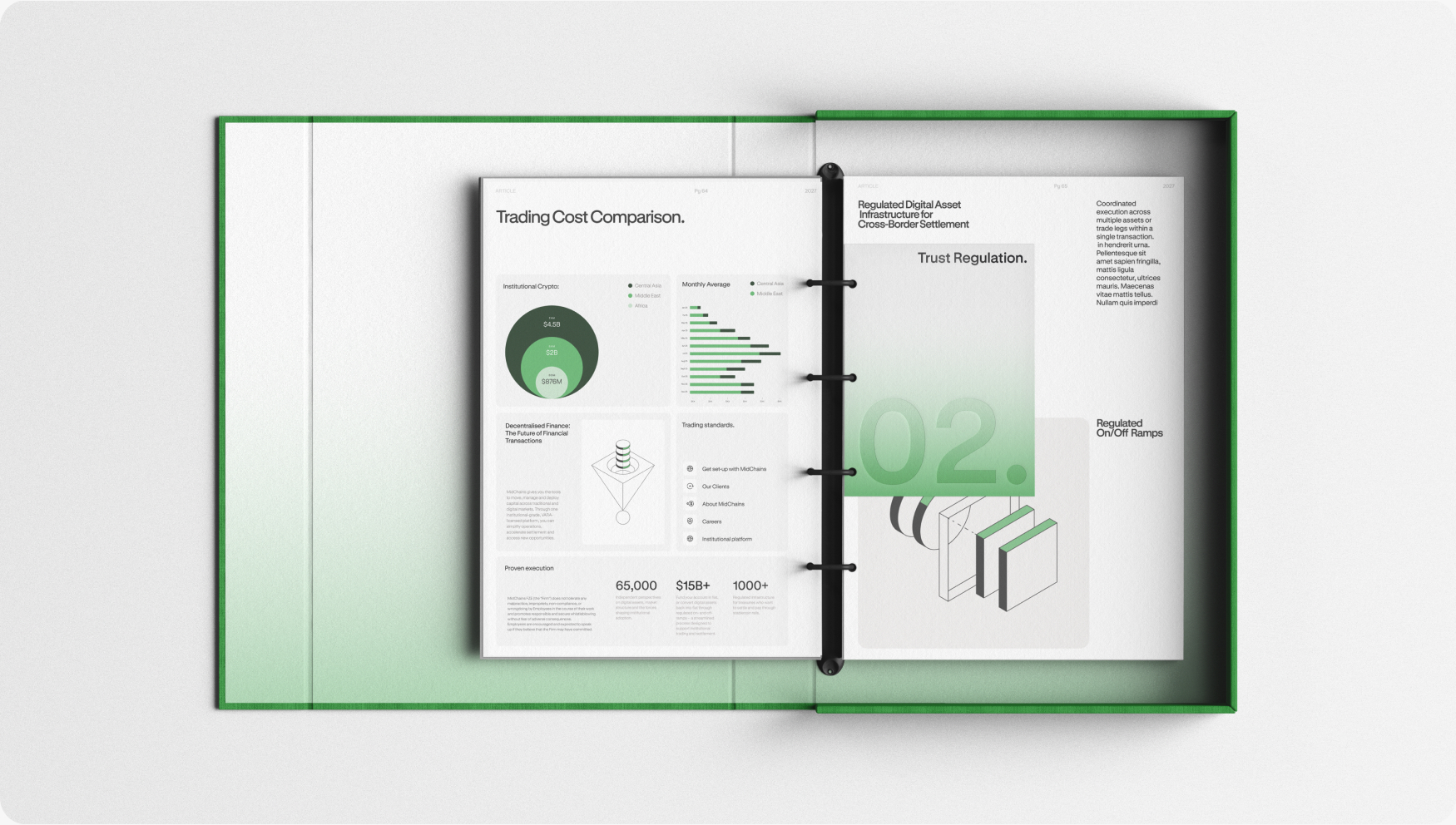
Our visual assets are broad and versatile to work across all aspects of the MidChains brand.
Photographic style
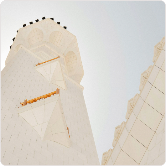
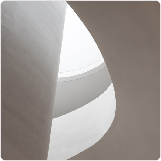
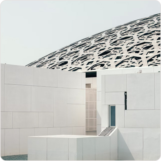
Our photographic style features cool tones and natural lighting.



3D assets
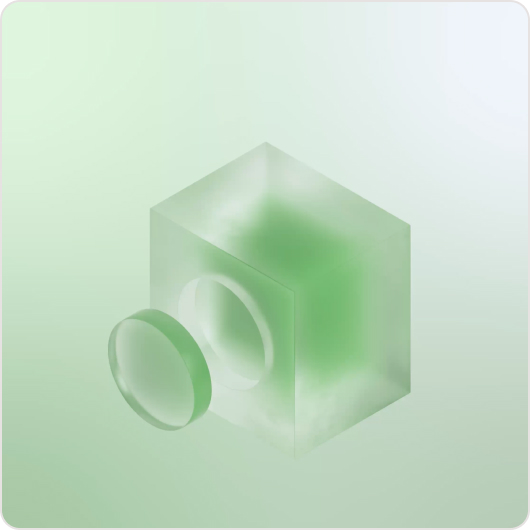
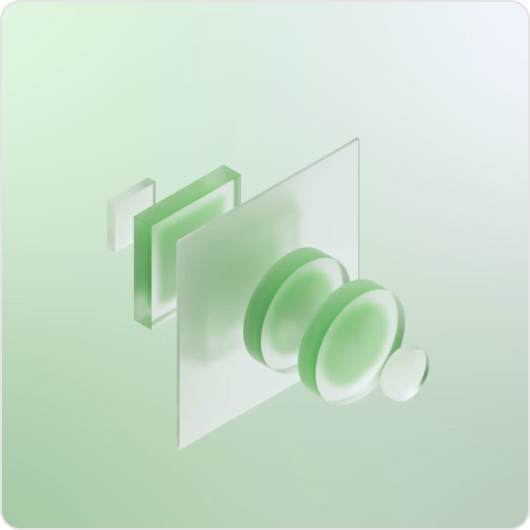
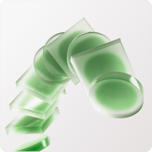
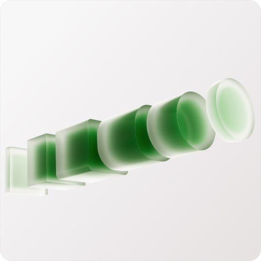
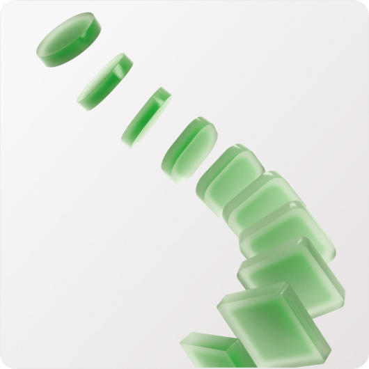
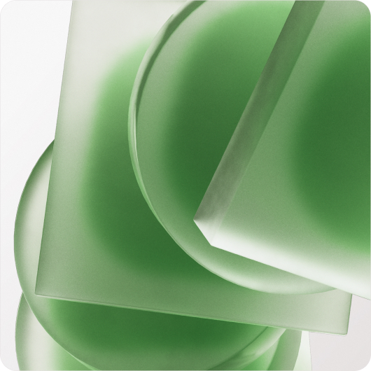
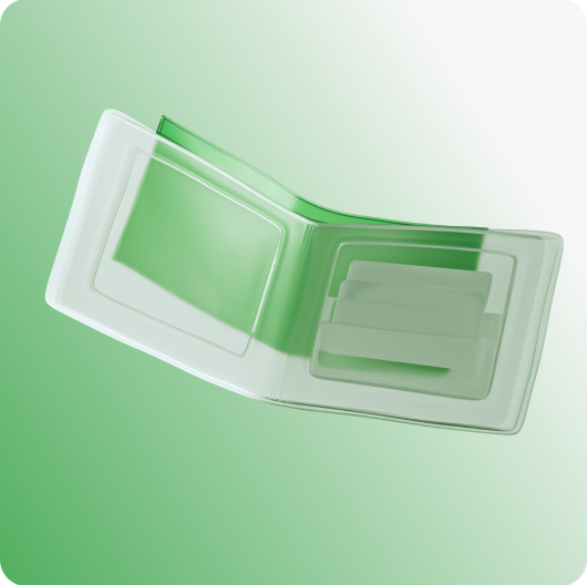
A core aspect of the MidChains brand is making the intangible, tangible. To support this we have a range of bespoke 3D assets.












Icons
We have a bespoke suite of icons that support clear navigation.
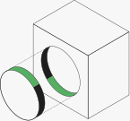
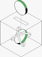
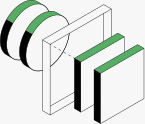
Isometric illustrations
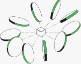
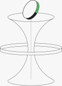
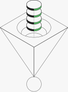
Similar to our 3D solution icons, we have a suite of isometric solution illustrations. Drawn in key-line with a hint of green.
UI illustrations
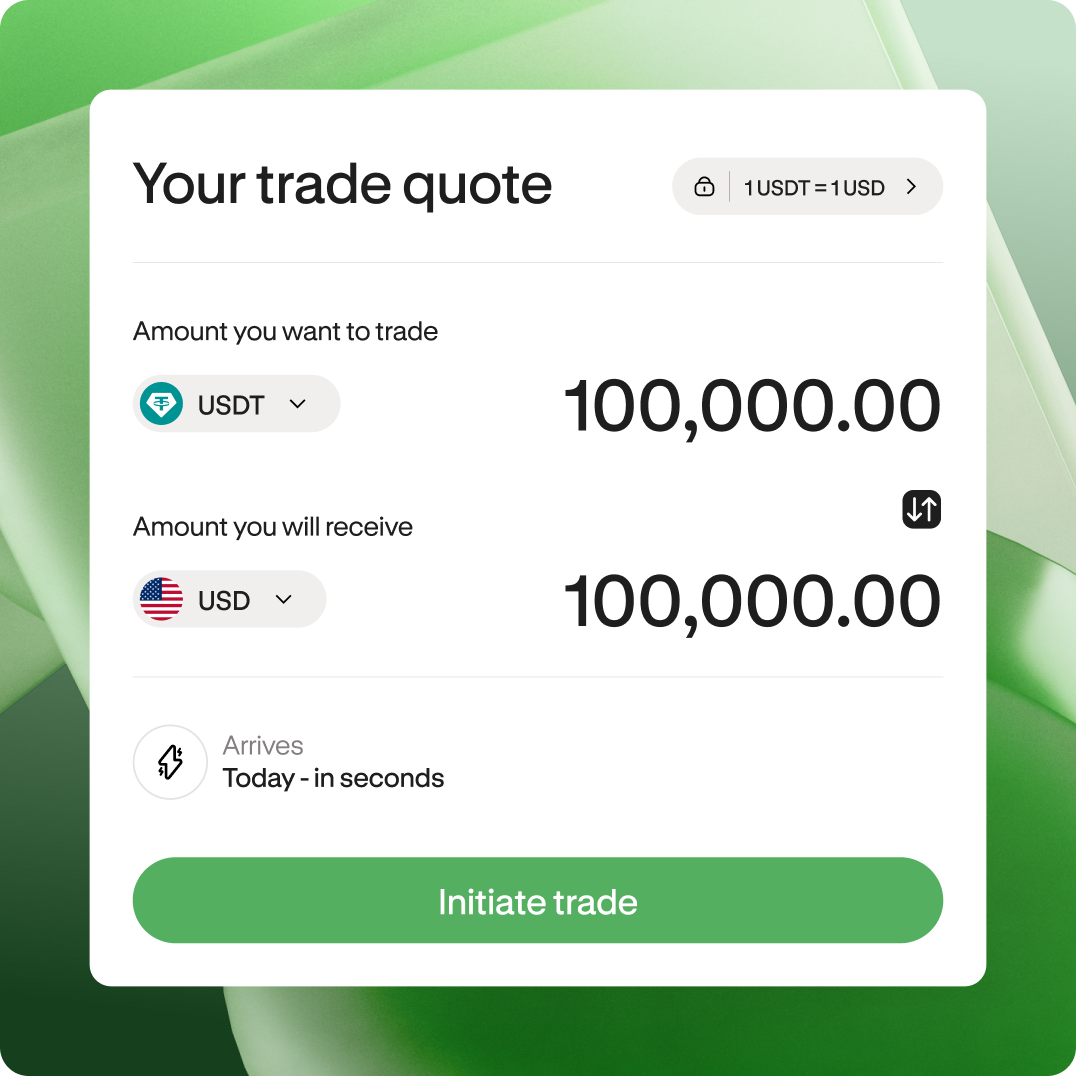
Often used to demonstrate the workflows and product features, our UI illustrations are clean, clear and unmistakably MidChains.
Our motion system
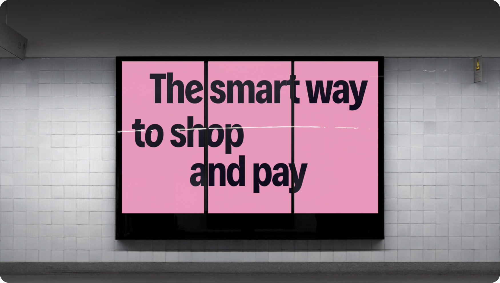
Echoing the frictionless nature of the MidChains brand, our motion system is seamless and satisfying. Our motion principles guide range from logo stings that make an impact, to satisfying 3D sequences and reassuring workflows.
Motion principles
Every animation should feel like an extension of what the brand already says: that moving money, and moving value, should be effortless, secure, and precise. These four principles govern how graphics, 3D and typography behave across the brand.
Logo slide
A logo slide is our main logo animation, ideal for most situations. It’s consistently used at the start, end, or both ends of content to punctuate the narrative.
Icon
The icon motion is to be used in shorter or smaller formats, revealing the mark quickly. This approach should be more simple.
Typography
Motion typography comes with pre-made text animations. Choose what to use based on the message, format, duration, and context. Always keep simplicity front of mind.
Special
There is a selection of special motion styles that keep our communication fresh.
Moving backgrounds
Always with a focus of simplicity, our motion backgrounds can add interest without detracting from the key focus.
Diagrammatic motion
MidChains make things simple, and we communicate this with our calm and clean diagrammatic motion.
3D motion
Our bespoke 3Ds are an integral part of the MidChains brand. They reinforce the idea of intangible, tangible. They exist as statics and also in motion - creating soothing and satisfying sequences.